Android Auto redesign

Scope & challenge
We had to redesign the entire system experience and update both 1P and 3P apps. We had to ensure compatibility with existing hardware while optimizing for new, larger displays. We integrated the latest Material Design language, refreshed the Assistant experience, and delivered all of it under the strict safety standards required for driving.
My role
Lead designer
UX Team
2 designers, 1 motion designer, 1 researcher
The problems
Minimal space
The previous version of Android Auto was optimized for smaller screens. Multi-tasking was minimal and the team only introduced additional features for some landscape displays, while ignoring portrait displays.
No home
The lack of a home screen (or resting state) meant that a user always had to choose an app to be in and sacrifice functionality from another ongoing activity.
Not smart
While the Assistant is great for starting a playlist or sending texts, it is not very useful beyond that. It lacked proactiveness and limited functionality.
Not Googley
Android Auto is a Google product, but the previous visual design did not align with other products from Google, creating a branding disconnect.


“Limiting time looking at the screen, that's the whole purpose of Android Auto. Making sure I can do things simply and without a lot of time looking at the screen.”
— Android Auto user
GOAL
Deliver a scalable, multitasking UI that adapts to any screen, puts the best of Assistant forward, and makes every user journey easier.


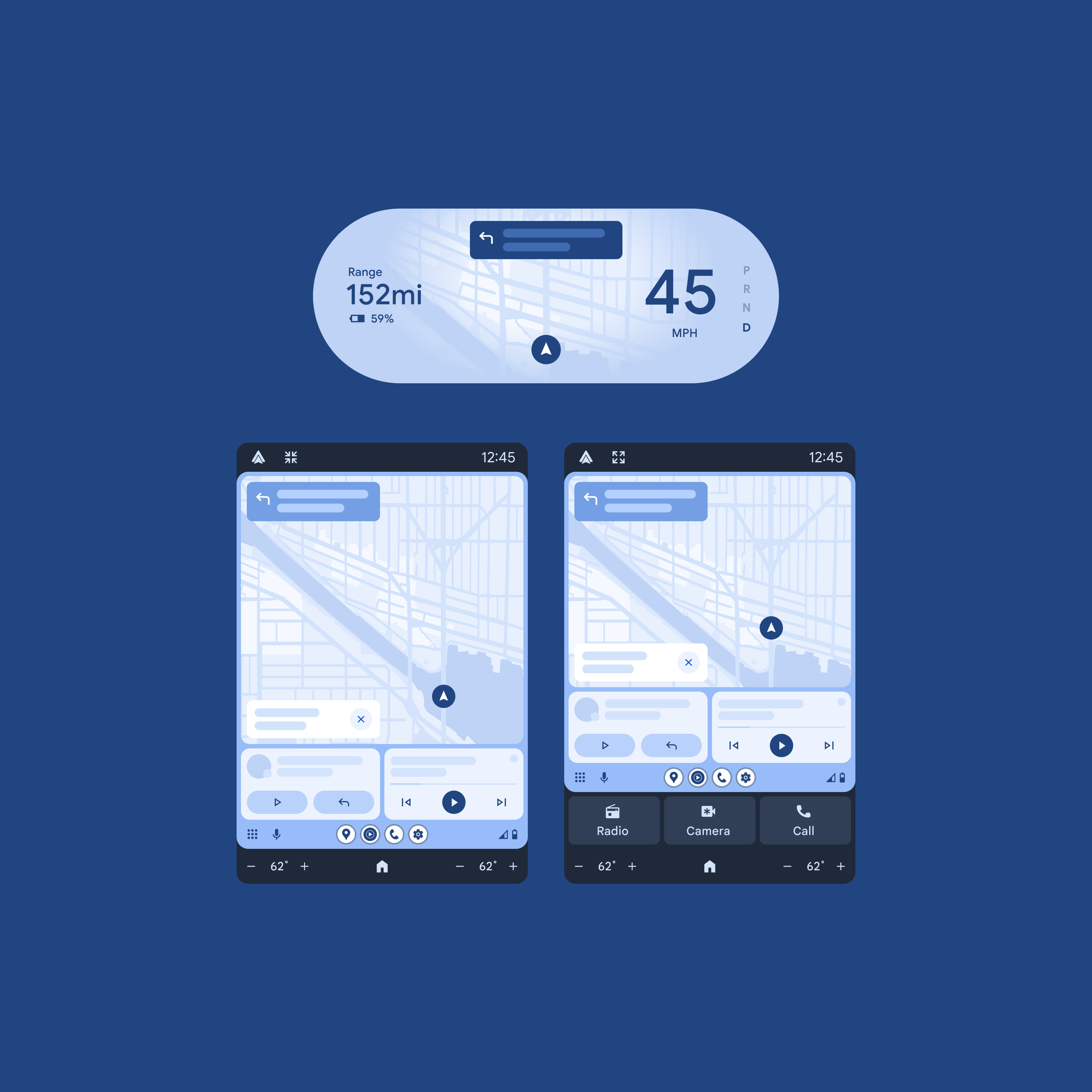
Visual iterations
-

Original
Lacked a dedicated home screen and limited multi-tasking capabilities.
-
New home screen
Explored a new dashboard layout with robust functionality.
-
Simplified
Simplified the dashboard and added gesture controls.
-

Final
The final design incorporated the latest Material design language and improved app switiching.
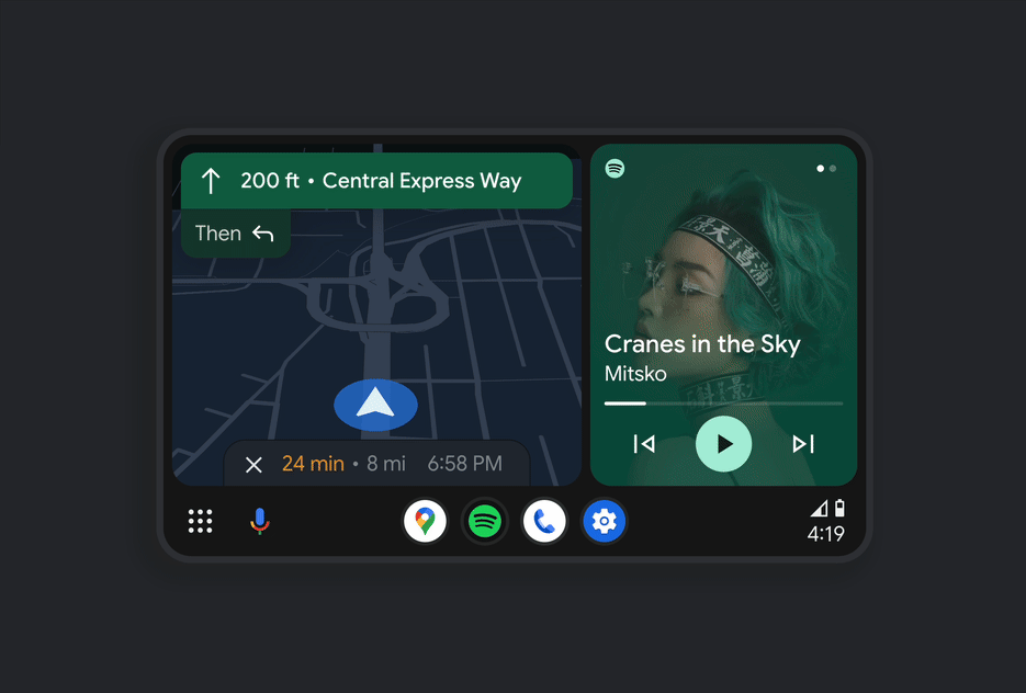
Improved multi-tasking
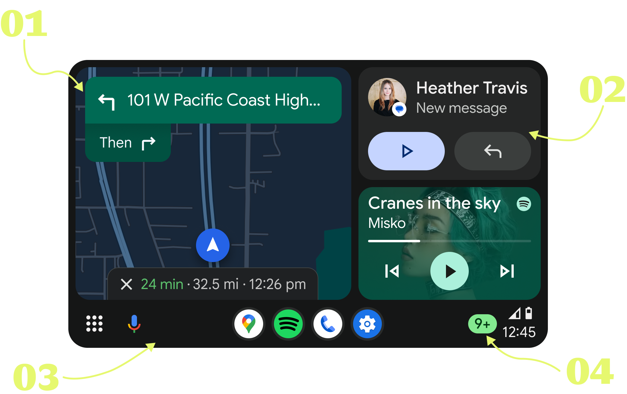
Maps closer to the driver by default, with an option to change the layout in settings.
Modernized style for media card, matching the system media card seen on Pixels. Plus contextual cards like suggestions, last message, and more.
A new app hot-seat in the system rail for quicker access to your favorite apps.
Notification center bell replaced with a badge counter for better transparency.
Scalable design
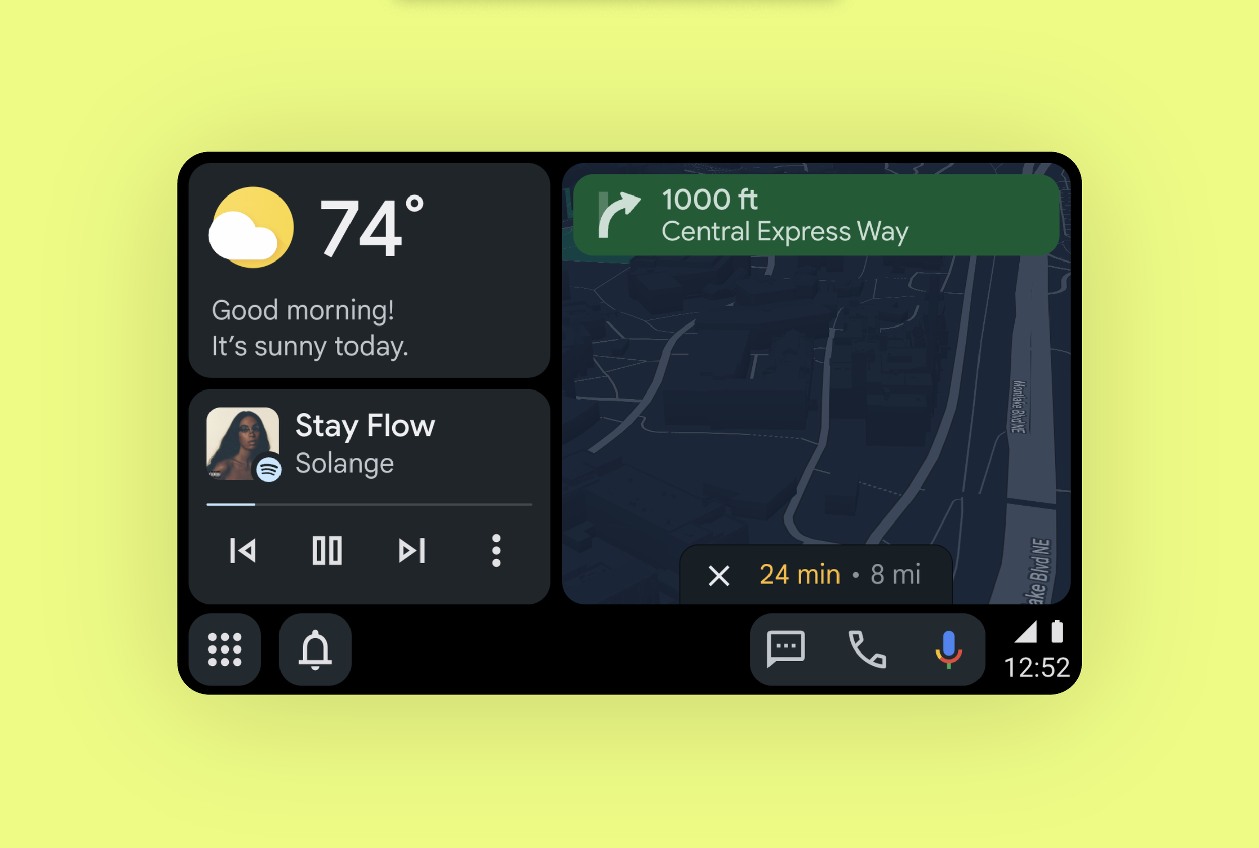
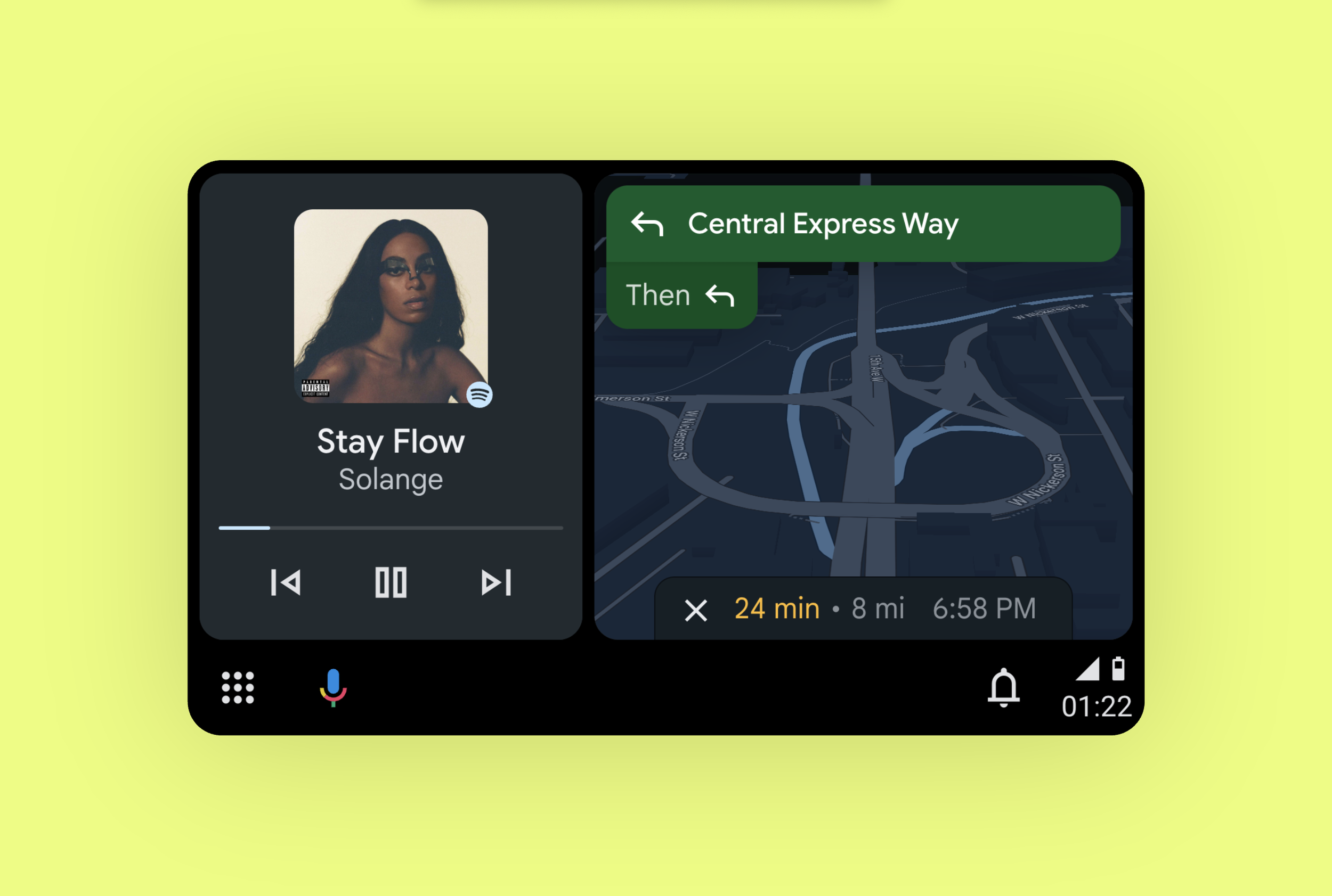
Assistant forward
-

Contextual
Example use case: get recommended locations and then an option to share your ETA.
-

Recommendations
Get Assistant suggested media based on your listening habits and media services.
-
Messages
Quick options and your most recent message are pinned on your dashboard.
-
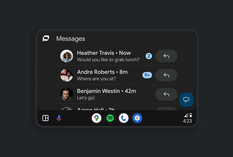
Smart
Get smart quick replies based on the context of your messages.
The impact
Improved multi-tasking
65% of driving time is in the dashboard, -11.5% app switches, -38% app launcher use
Voice forward CUJs
+ 6% Messaging, +3.5% Media minutes, +2% Assistant DAU, +7.7% Assistant WAU/WAD
Improved customer satisfaction
Redesign resulted in the highest jump in CSAT score ever for Android Auto!

What People Are Saying
“I use it all the time, love how you can split the screen with music and navigation.”
— Android Auto user
“Love the interface. Makes all the difference on trips.”
— Android Auto user
“It's very intuitive and works exactly how I imagined.”
— Android Auto user regarding Assistant
“I absolutely 100% fell in love with the new dashboard.”
— Android Auto user
All real quotes from CSAT surveys
Android Auto
Next project

Whole cabin experience
Going beyond the center display to expand our platform capabilities and put the ecosystem in every screen in the car.